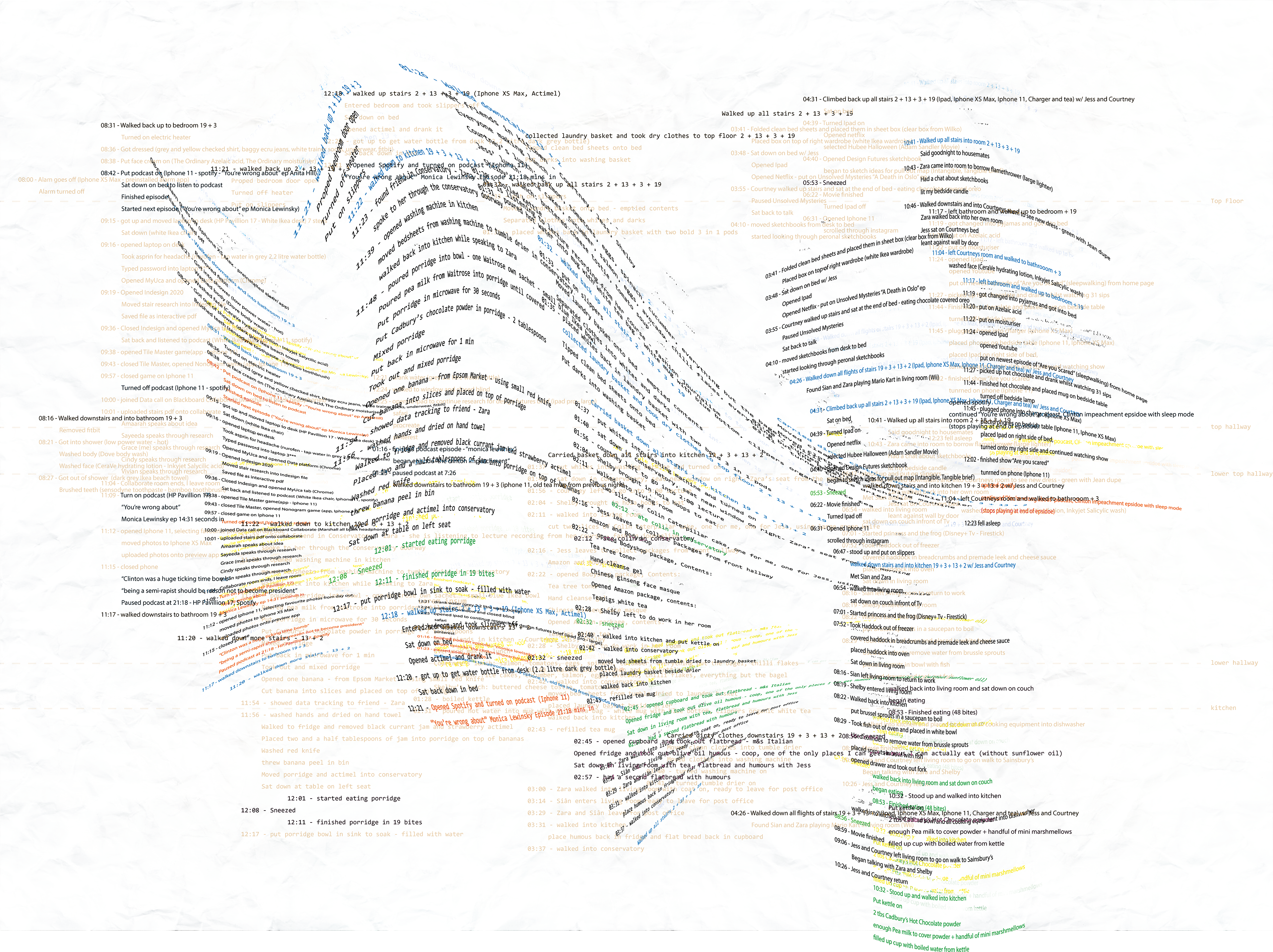
A four week project based on the collection and visualization of data. I completed a short version of this project first, collection only the data of stair use within a day. I then took what I learnt from this shortened version to create a more in-depth study of my 24hr data collection. This was visualised after much experimentation using a combination of shapes and text. Black circles representing each half hour of the time I was awake, the lines representing the length of each repeated task, each colour representing its own task. These colours can then be related back to their meanings through the text on the right of the poster with direct colour comparison.

24hr Data text experimentation


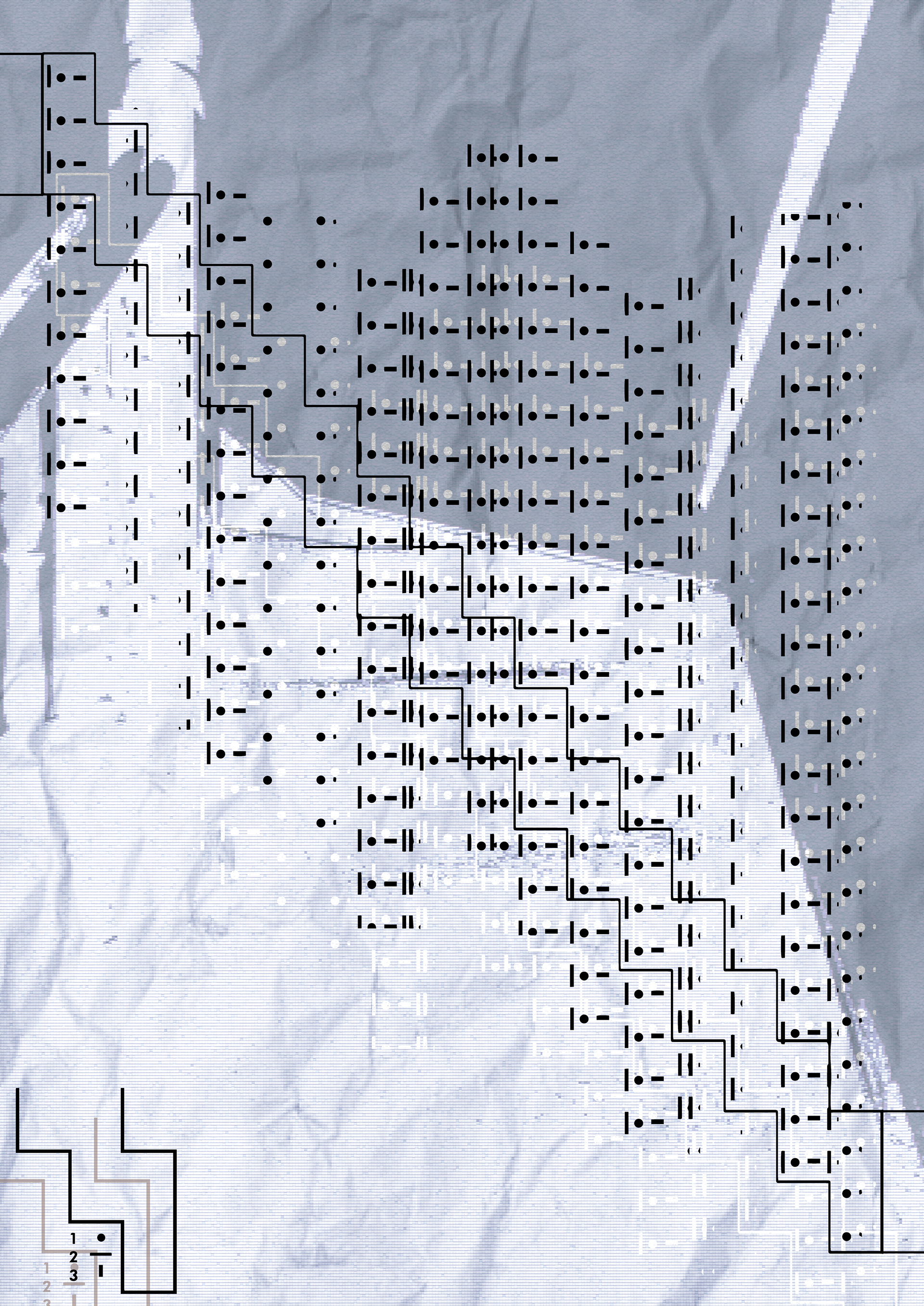
Stair Data visualisation